- The exact meaning of a landing page, in plain English, with no marketing jargon
- The real difference between a landing page and a regular website page
- Every major type of landing page, and when to use each one
- A step by step process for how to create a landing page from scratch
- Real examples of landing pages that convert, broken down piece by piece
- How to optimize a landing page for Google, AI Overviews, and actual human visitors
1 What Is a Landing Page
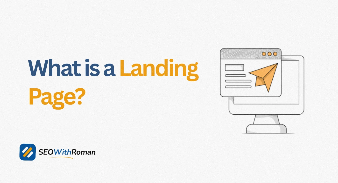
A landing page is a standalone web page built for one single purpose: to get the visitor to take one specific action. That action might be signing up for a newsletter, downloading a guide, booking a call, or buying a product. Nothing else on the page is allowed to compete with that one goal.
That is the landing page meaning in the simplest terms possible. It is not a homepage. It is not a blog post. It is a page created specifically to receive traffic from one source, an email, a Google ad, a social media post, or a QR code, and convert that visitor into a lead or a customer.
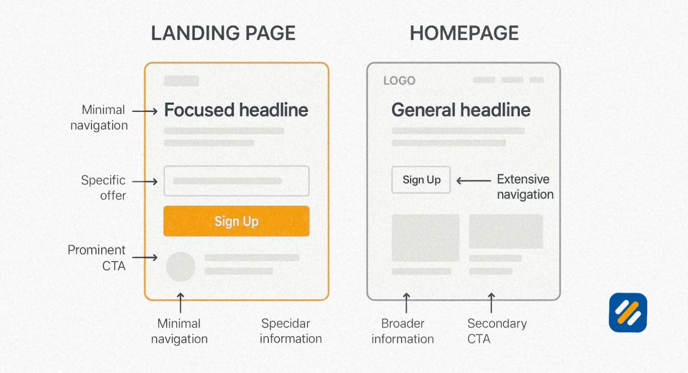
Here is what separates a true landing page from any other page on a website. A normal web page usually has a main navigation menu, links to other sections, and several possible things a visitor could do next. A landing page strips almost all of that away. Usually there is no navigation bar at all. There is one headline, one offer, and one button.
I have built landing pages for clients where simply removing the top navigation menu increased form submissions by double digits within two weeks, with absolutely nothing else on the page changed. That single detail tells you most of what you need to know about why this format works so well.
Quick answer if you are in a hurry: What's a landing page? It is a focused, single purpose web page designed to convert visitors through one clear call to action, separate from your site's main navigation and built for a specific marketing campaign.
2 Landing Page vs Website: What's Actually the Difference
This is one of the most searched questions on this topic, and most explanations make it more complicated than it needs to be. Here is the difference between a website and a landing page laid out plainly.
A website is the whole collection of pages that make up your online presence, your homepage, your about page, your services pages, your blog, your contact page, all connected through a navigation menu. A landing page is usually just one page, often not even linked from that main navigation menu, built to serve a single campaign or offer.
| Aspect | Website (Homepage) | Landing Page |
|---|---|---|
| Purpose | Introduce your brand broadly | Convert visitors toward one action |
| Navigation | Full menu, many links | Minimal or no navigation |
| Number of goals | Several | One |
| Traffic source | Mixed, organic search, direct, referrals | Specific, one ad, one email, one campaign |
| Content focus | General overview of the business | One offer, one audience, one message |
| Typical visitor | Still deciding what they want | Already interested, ready to act |
A website's homepage is a front door for anyone who walks up. A landing page is more like a VIP entrance built for one specific group of people who already know why they are there. Neither replaces the other, a strong business needs both working together.
3 Why Is a Landing Page Important (The Purpose Explained)
The purpose of a landing page comes down to one word: focus. Every element on the page exists to drive the visitor toward a single decision, which removes the distraction that kills conversions on regular web pages.
This matters more than most people realize because of something researchers call the paradox of choice. The more options you give a person, the harder it becomes for them to choose any of them. A homepage with ten links competing for attention will almost always convert worse for a specific offer than a landing page built around that one offer alone.
Why landing page is important also comes down to measurement. Because a landing page exists for one campaign and one goal, you can measure its performance with total clarity. You know exactly which ad, which email, or which post sent that traffic, and you know exactly whether that traffic converted. Mixing that same offer into a general website page makes this kind of clean measurement almost impossible.
A dedicated landing page marketing strategy also protects your ad spend. Paid platforms like Google Ads reward relevance. When your ad promises a specific discount and the visitor lands on a page built around that exact discount, your Quality Score improves and your cost per click tends to drop. Send that same ad traffic to a generic homepage instead, and you typically pay more for worse results.
4 Types of Landing Pages You Should Know
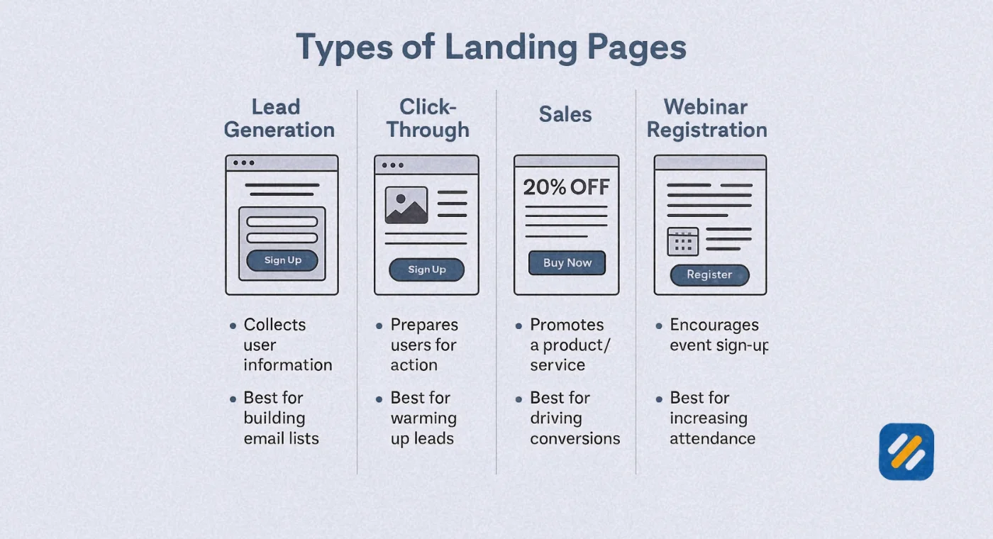
Not every landing page is built the same way, because not every goal is the same. Most landing pages fall into two broad categories, with several useful subtypes inside each one.
| Type | Main Goal | Core Element | Best Used For |
|---|---|---|---|
| Lead generation page | Collect contact details | A form | Ebooks, webinars, free trials, newsletters |
| Click-through page | Drive a direct action | A CTA button | Ecommerce checkout, bookings, upgrades |
| Squeeze page | Capture an email address only | A minimal single field form | Email list building |
| Sales landing page | Convert directly into a purchase | Pricing, testimonials, urgency | Product launches, limited offers |
| Event landing page | Collect RSVPs or ticket sales | A registration form or button | Webinars, conferences, local events |
| Thank you page | Confirm an action and nurture further | A follow up offer or next step | After a signup or purchase completes |
A sales landing page deserves special mention because it behaves differently from a typical lead generation page. Instead of asking for an email in exchange for something free, it asks directly for a purchase, which means it needs to do more persuasive work in one page, pricing clarity, social proof, urgency, and a frictionless checkout path all in one place.
5 The Key Elements of a High-Converting Landing Page
A website landing page that actually converts is not a matter of luck, it is built from a consistent set of elements that work together. Leave one out and the whole page tends to underperform.
A clear headline: states the exact benefit in under ten words, written for a skimmer, not a reader
A single, focused CTA: one action, repeated if the page is long, never competing options
A visual hierarchy: the eye should be guided naturally toward the CTA without effort
Supporting proof: testimonials, numbers, logos, or reviews that back up the claim
Minimal or no navigation: nothing should offer an exit ramp away from the goal
Mobile-first design: most landing page traffic today arrives from a phone, not a desktop
Fast load speed: every extra second of load time measurably lowers conversion rates
6 How Do You Create a Landing Page (Step by Step)
Here is the real process, stripped of fluff, for how to create a landing page that works.
Define one specific goal. Decide exactly what action you want the visitor to take before you write a single word of copy. A page trying to do two things will usually do neither well.
Match the page to your traffic source. The message, tone, and offer on the page should mirror whatever the visitor just clicked, the ad, the email, or the post that brought them here.
Write the headline first. This is the single most tested element on any landing page, and it should communicate the core benefit before anything else.
Build the offer and the proof around that headline. Add only what supports the decision, pricing, benefits, testimonials, or a demo, and cut anything that does not.
Design one CTA and repeat it if needed. Use action focused language, Start My Free Trial performs better than a vague Submit, on every version of the button.
Remove the navigation menu. Unless there is a clear reason to keep it, a landing page without an exit route consistently converts better than one with a full menu.
Test on mobile before you publish. Check load time, form usability, and button size on an actual phone, not just a resized browser window.
Publish, then A/B test. Your first version is a starting point, not the finished product. Test headlines, CTA wording, and layout against real traffic data.
7 What Is an Example of a Landing Page (Real Breakdowns)
Seeing a working example makes the concept click faster than any definition. Here are two real patterns you will recognize immediately, broken down into what actually makes them effective.
Example one, a free trial software landing page. The headline states the core benefit in one line, something like "Run Your First Report in Five Minutes." Below it sits a single signup form asking only for an email and a password, nothing else. A short row of recognizable client logos sits just under the form for instant trust, and the only other content on the page is a three line summary of what happens after signup. There is no navigation bar, and the only link on the entire page is the signup button itself.
Example two, a webinar registration landing page. The headline promises a specific outcome tied to a date, such as "Learn the Three Metric Framework, Live on Thursday." A short paragraph explains who the session is for, followed by three bullet points covering what attendees will walk away with. The form asks for a name and email only, and a countdown timer above the fold adds urgency. A single speaker photo and one line bio builds credibility without pulling focus from the registration form.
What is a landing page website really coming down to in both examples is removal. Every unnecessary word, link, and choice has been stripped out until only the path to conversion remains.
8 Landing Page SEO: Getting Found in Google and AI Search
Marketing landing pages built purely for paid traffic often skip SEO entirely, which is a missed opportunity. A well-optimized landing page can also earn organic search traffic for months or years after a paid campaign ends.
Target a specific, intent-matched keyword: a landing page ranks best for a focused phrase that matches exactly what the visitor is looking to do or buy
Match your H1 to your meta title: when the headline a visitor clicks in search results also appears as the page's main heading, bounce rate drops noticeably
Write a genuine meta description: this is your pitch in the search results, it should state the offer plainly, not just repeat the headline
Keep load speed fast: compress images and avoid heavy scripts, since slow pages lose both rankings and conversions
Add structured, scannable content: AI Overviews and Google's featured snippets both favor pages with clear headings and direct answers near the top of a section
Earn a few quality backlinks: even a handful of links from relevant, trustworthy sites meaningfully improves how both Google and AI search tools trust the page
For AI Overview and generative search visibility specifically, answer the core question your landing page exists to solve within the first two sentences of the page's main copy, then support it with detail. AI systems tend to pull from pages that state the value clearly before elaborating, rather than pages that build up to the point slowly.
9 Landing Page vs Sales Page vs Squeeze Page: Quick Clarification
These three terms get used almost interchangeably online, but they are not the same thing, and knowing the difference will save you from building the wrong page for your goal.
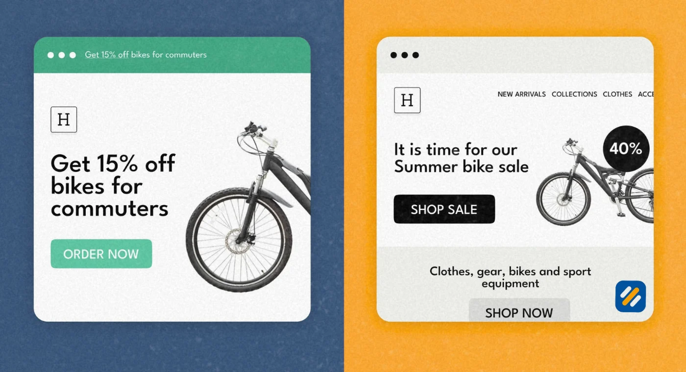
A landing page is the broad umbrella term covering any standalone page built for one conversion goal. A squeeze page is a specific, extremely minimal type of landing page built to capture just one piece of information, almost always an email address, often with nothing on the page but a headline and a single input field. A sales page is also a type of landing page, but it is built specifically to drive a direct purchase, which means it typically runs much longer, with pricing, objection handling, testimonials, and guarantees all included to close the sale in one visit.
If your only goal is growing an email list as fast as possible, a squeeze page outperforms a longer page because there is nothing else to distract from the form. If your goal is a direct sale of a higher priced product, a longer sales landing page usually outperforms a short one, because it gives you room to answer objections before asking for the purchase.
10 Common Mistakes That Quietly Kill Conversions
Multiple competing CTAs: offering a free trial, a demo booking, and a newsletter signup on the same page dilutes all three
Keeping the full site navigation: every link is an exit door away from your one goal
Asking for too much information upfront: a form with eight fields converts far worse than one asking for just a name and email
Mismatched messaging: if your ad promises a discount and the landing page never mentions it clearly, visitors leave within seconds
Ignoring mobile users: a page that loads slowly or renders awkwardly on a phone loses the majority of modern traffic before they even see the offer
No social proof anywhere: visitors who have never heard of your brand need some form of third party validation before they will hand over their information
11 How to Measure Whether Your Landing Page Is Working
| Metric | What It Tells You | What Good Looks Like |
|---|---|---|
| Conversion rate | Percentage of visitors who complete the goal | 2 to 5 percent is typical, 10 percent or higher is strong |
| Bounce rate | Visitors who leave without any interaction | Lower is better, high bounce often means a mismatch with the traffic source |
| Average time on page | How long visitors engage before deciding | Varies by page length and offer complexity |
| Traffic source breakdown | Where your highest converting visitors come from | Helps you reallocate ad and content budget toward what actually works |
Tracking these numbers consistently, rather than checking once and forgetting about the page, is what separates landing pages that improve over time from ones that quietly underperform for months without anyone noticing.
12 Tools and Trusted Sources for Further Research
| Resource | What It Helps With | Link |
|---|---|---|
| Google Ads Help, Landing Page Experience | Official Google guidance on landing page quality scoring | support.google.com/google-ads |
| Google Search Central | How Google crawls and evaluates web page content | developers.google.com/search |
| Google PageSpeed Insights | Test your landing page's load speed and mobile performance | pagespeed.web.dev |
| Nielsen Norman Group, Usability Research | Independent research on web page design and user behavior | nngroup.com |
| WordStream Conversion Rate Benchmarks | Industry average conversion rate data by sector | wordstream.com |
13 Three Expert Tips for Better Landing Pages
Tip 1: Write your headline last, not first. It feels backwards, but writing the full offer and body copy before the headline almost always produces a sharper, more specific headline, because you have already worked out exactly what makes the offer compelling.
Tip 2: Cut your form fields in half. Before publishing, go through every field on your form and ask whether you genuinely need it to make the first contact. You can always collect more information later, once the lead already trusts you enough to reply to a follow up email.
Tip 3: Build one landing page per audience, not one for everyone. A single generic page trying to speak to every type of visitor will always underperform several shorter pages, each written for one specific audience segment with language that matches exactly how that group thinks about the problem.
14 Conclusion
A landing page is not just a trendy marketing term, it is one of the most measurable, highest leverage tools available in digital marketing, precisely because it does one thing and removes everything else. Understanding what a landing page is, and more importantly, understanding why removing choice and distraction makes it convert better than a regular web page, changes how you think about every campaign you run afterward.
Start with one clear goal, one focused headline, and one CTA. Everything else on this list exists to support that single decision, not compete with it.
Have a question about building your first landing page, or want feedback on one you already have live? Drop a comment below and I will take a look personally.
Join 1,000+ business owners and bloggers who get one actionable SEO tip every week — straight to their inbox. Free forever.
Get Free Weekly Tips →