- More than 60% of all Google searches now happen on mobile devices making a mobile friendly website non-negotiable in 2026
- Google uses mobile first indexing meaning it crawls and ranks your mobile version before your desktop version
- Responsive web design is the single most recommended approach by Google for building a mobile friendly website
- A mobile friendly website loads in under 3 seconds, uses readable font sizes, and has tap targets at least 48 pixels wide
- You can test whether your site is mobile friendly for free using Google PageSpeed Insights and Chrome DevTools
1 Why Making Your Website Mobile Friendly Is No Longer Optional
Let me start with a number that should make every website owner sit up straight.
According to Statcounter, mobile devices generate more than 60% of all global web traffic in 2026. That means more than half of every person visiting your website right now is doing so on a phone, not a desktop computer.
But here is the part that directly affects your Google rankings and not just your user experience. In 2019 Google officially switched to mobile first indexing for all websites. This means Google crawls and evaluates your mobile version first when deciding where to rank your pages. Your desktop site is secondary. If your mobile experience is poor, your rankings suffer regardless of how good your desktop version looks.
I have audited dozens of small business websites over many years and the pattern is consistent. A website that looks beautiful on desktop but breaks on mobile will consistently rank below competitors with simpler but properly mobile optimised sites. Google is not ranking your desktop. It is ranking your phone.
The good news is that making a website mobile friendly is not as technical as most beginners fear. Whether you are on WordPress, a website builder, or a custom coded site, the core principles are the same and most of them can be implemented without a developer.
2 What Does Mobile Friendly Actually Mean | The Real Definition
Before diving into how to fix it, let us be precise about what mobile friendly actually means. The term gets used loosely and that causes confusion about what you are actually trying to achieve.
A mobile friendly website is one that
- Displays correctly on any screen size without requiring horizontal scrolling
- Has text large enough to read without zooming in
- Has buttons and links spaced far enough apart to tap accurately with a finger
- Loads in under 3 seconds on a standard mobile connection
- Does not use technology that does not work on mobile, such as Flash
- Adjusts its layout automatically based on the screen size of the device
What a mobile friendly website is not is a separate website built for phones. That approach, called a separate mobile site usually identified by an m dot subdomain, creates duplicate content problems for SEO and doubles your maintenance workload. The modern standard is a single responsive website that adapts to every screen size automatically.
There is also an important distinction between mobile friendly and mobile optimised. A mobile friendly site simply works on mobile without breaking. A mobile optimised site is specifically designed with mobile users in mind from the start, with touch-friendly navigation, thumb-reachable buttons, and content prioritised for small screens. The difference matters because Google rewards the latter with better rankings and lower bounce rates.
3 Responsive Design vs Adaptive Design | Which One Should You Use
When making your website mobile friendly, you will encounter two main technical approaches. Understanding the difference helps you make the right decision for your specific situation.
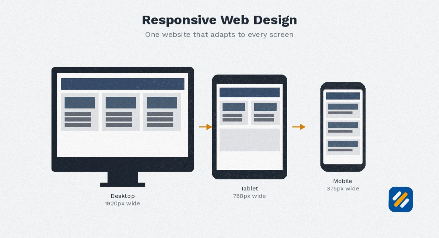
Responsive web design uses flexible layouts built with CSS that automatically adjust to fit any screen size. The same HTML is served to every device and CSS media queries change how it looks based on screen width. This is the approach Google officially recommends and it is what the vast majority of WordPress themes, Wix templates, and modern website builders use by default.
Adaptive design serves a completely different HTML layout depending on the device detected. The server identifies whether the visitor is on mobile or desktop and sends the appropriate version. This gives more precise control over the mobile experience but requires building and maintaining two separate codebases.
| Factor | Responsive Design | Adaptive Design |
|---|---|---|
| How it works | One flexible layout adjusts to all screens | Multiple fixed layouts served per device |
| Google's recommendation | Preferred and officially recommended | Supported but more complex to manage |
| Maintenance effort | Single codebase, easier to update | Multiple versions to maintain separately |
| Best for | Small businesses, blogs, WordPress sites | Large enterprise sites needing precise mobile control |
| SEO impact | Strong, avoids duplicate content issues | Risk of duplicate content if not configured correctly |
| Implementation cost | Lower, most themes handle it automatically | Higher, requires custom development |
| Performance | Consistent across devices | Can be faster on mobile if optimised correctly |
For any small business website or personal brand blog, responsive web design is the correct choice. It is what Google recommends, what most WordPress themes already use, and what requires the least ongoing maintenance.
4 How to Make Your Website Mobile Friendly on WordPress Step by Step
Since the majority of small business websites run on WordPress, this section covers the exact process for making a WordPress site fully mobile responsive without touching a line of code.
Step 1: Switch to a responsive WordPress theme
The foundation of a mobile friendly WordPress website is a responsive theme. Most modern WordPress themes are responsive by default but many older themes are not. Go to Appearance then Themes in your WordPress dashboard and check whether your current theme specifically states it is responsive or mobile friendly in its description.
If you are starting fresh or need to switch, Astra is the fastest and most SEO-compatible free responsive theme available. It scores consistently high on Google PageSpeed Insights on mobile and is compatible with Elementor, Rank Math, and all major SEO plugins.
Step 2: Install and configure a caching plugin
Site speed is one of the most critical components of a mobile friendly website. Mobile connections are slower than desktop broadband, so your site needs to load faster to compensate. Install WP Rocket if budget allows. If not, WP Super Cache is a free alternative that significantly improves mobile load times by serving static cached versions of your pages instead of dynamically generating them on every visit.
Step 3: Compress all images before uploading
Uncompressed images are the single biggest cause of slow mobile load times on WordPress websites. Install Smush or ShortPixel, both have free tiers, and run bulk compression on all existing images. Going forward, compress every image before uploading it. For most blog images, a file size under 100KB is achievable without visible quality loss.
Step 4: Set your viewport meta tag
In WordPress this is typically handled automatically by your theme but it is worth verifying. The viewport meta tag tells mobile browsers how to scale your page. Without it, mobile browsers default to rendering your page at desktop width and then shrinking it down, which creates the tiny unreadable text that characterises non-mobile-friendly sites. In Rank Math go to Titles and Meta and verify the viewport tag is enabled.
Step 5: Use a mobile-friendly font size
Google recommends a minimum font size of 16 pixels for body text on mobile. Anything smaller requires zooming and Google's mobile usability report will flag it as an issue. In your Astra or Elementor settings, set your base body font to 16px or larger and your heading fonts proportionally above that.
Step 6: Check and fix tap targets
Tap targets are any clickable element including buttons, links, and menu items. Google's recommended minimum tap target size is 48 by 48 pixels with at least 8 pixels of spacing between adjacent targets. Tap targets that are too small or too close together cause accidental clicks and frustrate mobile users. Use Google Search Console's mobile usability report to identify any tap target issues on your specific pages.
Step 7: Simplify your navigation for mobile
Desktop navigation menus with dropdown submenus do not translate well to mobile. Most responsive WordPress themes automatically collapse the navigation into a hamburger menu on mobile, which is the correct approach. Verify your mobile menu is accessible, the items are large enough to tap, and the most important pages are reachable within two taps from the homepage.
5 How to Make a Website Responsive for Mobile Using CSS
For developers or technically confident website owners who manage custom-coded websites, here is how responsive web development works at the code level.
Responsive design in CSS is controlled through media queries. A media query applies specific CSS rules only when certain conditions are met, typically when the screen width falls below a defined breakpoint.
Here is a basic example of how a responsive layout is structured
The default CSS styles your desktop layout. Then you add a media query targeting screens below 768 pixels wide, which covers most mobile phones. Inside this query you override the desktop styles with mobile-appropriate alternatives. For example, a two-column desktop layout becomes a single column on mobile, font sizes increase, padding adjusts for smaller screens, and navigation elements stack vertically.
Common breakpoints used in mobile responsive web design
| Breakpoint | Target Device | CSS Width |
|---|---|---|
| Extra small | Small phones | Below 576px |
| Small | Standard phones | 576px to 767px |
| Medium | Tablets and large phones | 768px to 991px |
| Large | Small laptops and large tablets | 992px to 1199px |
| Extra large | Desktop monitors | 1200px and above |
The mobile first approach in CSS means you write your base styles for mobile first, then use min-width media queries to add desktop styles as the screen gets larger. This is the opposite of how many older websites were built and it produces cleaner, faster-loading code for mobile users.
The most practical implementation for non-developers on WordPress is to use Elementor's responsive controls, which let you set different values for desktop, tablet, and mobile without writing any CSS directly.
6 How to Change Your Website to Mobile View for Testing
Before you can fix mobile issues you need to see exactly what your website looks like on a phone. Here are four ways to do this without owning multiple devices:
Chrome DevTools Device Emulator
This is the fastest and most commonly used method. Open your website in Google Chrome, right-click anywhere on the page and select Inspect. Click the device icon at the top of the panel that appears. This switches your browser into device emulation mode. You can then select any device from the dropdown list including iPhone models, Samsung Galaxy phones, and iPad sizes. This shows you how your layout renders at different screen widths.
Google PageSpeed Insights
Go to pagespeed.web.dev and enter your URL. The tool runs a full analysis of your page on both mobile and desktop and provides separate scores for each. The mobile score is the one that matters most for Google rankings. Any score below 70 on mobile indicates significant performance issues that need addressing.
Google Search Console Mobile Usability Report
If you have Google Search Console set up for your website, go to Experience then Mobile Usability in the left sidebar. This report shows you real data from Google's crawl of your site and flags any pages with specific mobile usability problems including text too small to read, clickable elements too close together, and content wider than the screen.
Real Device Testing
No emulator perfectly replicates the experience of a real phone. Once you have made your mobile improvements, always test on at least two real devices: one iOS and one Android. The differences in how Safari and Chrome render pages can reveal issues that emulators miss.
7 How to Make Your Website More Accessible on Mobile
Mobile accessibility and mobile friendliness are closely related but not identical. Making your website accessible means ensuring people with disabilities can also use it effectively on mobile. This matters both ethically and for SEO, because accessible websites consistently score better on Core Web Vitals and usability metrics.
Here is what mobile accessibility requires in practice
Sufficient colour contrast. Text must have a contrast ratio of at least 4.5 to 1 against its background for normal text and 3 to 1 for large text. Low contrast text is unreadable outdoors on a phone screen in sunlight, which is where a significant portion of your mobile traffic reads your content.
Alt text on all images. Screen readers used by visually impaired mobile users read alt text to describe images. Every image on your website should have a descriptive alt text that explains what the image shows. This also directly benefits SEO as Google uses image alt text as a ranking signal.
Logical heading structure. Your H1, H2, and H3 headings should follow a logical hierarchy. Screen readers navigate pages by jumping between headings and a broken heading structure makes your content impossible to navigate for visually impaired users.
Touch target sizing. The 48 by 48 pixel minimum recommended for tap targets also directly benefits users with motor difficulties who have less precision when tapping a phone screen.
No content that relies on hover states. Hover effects work on desktop with a mouse cursor but do not exist on touch screens. Any content that only appears on hover, such as dropdown menus or hidden tooltips, is completely invisible to mobile users.
8 Mobile Friendly Web Design Best Practices That Go Beyond the Basics
Most guides cover the same standard tips. These are the practices that separate genuinely great mobile experiences from sites that simply pass Google's mobile usability test.
Design for thumbs, not fingers. Most mobile users hold their phone in one hand and navigate with their thumb. The bottom third of a phone screen is the most easily reachable area. Place your most important call to action buttons and primary navigation in this zone. The top left corner of a phone screen is the hardest area to reach one-handed. Never put your most important interactive element there.
Eliminate anything that does not serve mobile users directly. Desktop sidebars, complex data tables, multi-column layouts, and decorative elements that add visual weight without informational value all create friction on mobile. Every element on your mobile page should earn its place by directly serving the mobile user's primary goal.
Use system fonts when possible. Custom web fonts require an additional HTTP request and a download before your text renders. On mobile connections this creates a flash of invisible text while the font loads. System fonts like San Francisco on iOS and Roboto on Android load instantly because they are already on the device. For a blog focused on content, system fonts often look better on mobile than decorative web fonts anyway.
Preload your largest image. The Largest Contentful Paint metric in Core Web Vitals measures how long it takes for the main content image to appear. On mobile this is usually the hero image or the featured blog post image. Adding a preload link tag in your page head for this image tells the browser to download it as a priority before anything else, which directly improves your LCP score and your mobile ranking signals.
9 How to Check if Your Website Is Mobile Friendly | Free Tools Compared
| Tool | What It Tests | Cost | Best For |
|---|---|---|---|
| Google PageSpeed Insights | Speed, Core Web Vitals, mobile performance score | Free | Overall mobile performance score |
| Chrome DevTools | Visual rendering at any screen size | Free | Seeing exactly how your layout looks on mobile |
| Google Search Console | Real crawl data, mobile usability errors | Free | Finding specific pages with mobile problems |
| GTmetrix | Detailed speed waterfall, page size analysis | Free tier available | Diagnosing specific speed bottlenecks |
| BrowserStack | Real device testing across 3,000 device and browser combinations | Paid | Testing on specific phone models accurately |
| Screaming Frog | Crawls your site and flags mobile configuration issues | Free up to 500 URLs | Technical mobile SEO audit |
| Lighthouse in Chrome | Full performance, accessibility, and SEO audit | Free | Comprehensive mobile quality assessment |
For a WordPress small business website, the combination of Google PageSpeed Insights and Google Search Console gives you everything you need to identify and fix mobile issues without spending anything.
10 3 Expert Tips to Make Your Mobile Website Perform Better Than Your Competitors
Tip 1: Fix Your Largest Contentful Paint Score First
When Google evaluates your mobile performance the single metric that has the most direct impact on rankings is Largest Contentful Paint. This measures how long it takes for the most important visible element, usually your hero image or main heading, to fully appear. A score under 2.5 seconds is good. Over 4 seconds is poor. Compressing your hero image, preloading it, and serving it in WebP format typically drops LCP scores by 1 to 2 seconds on mobile without any other changes.
Tip 2: Never Use the Same Pop-Up Strategy on Mobile That You Use on Desktop
Pop-ups that cover the full screen on mobile are penalised by Google's intrusive interstitials algorithm. I have seen websites lose 20 to 40% of their mobile organic traffic after a Google algorithm update targeted exactly this issue. If you use a newsletter pop-up or exit intent pop-up, make sure it covers less than 30% of the mobile screen and has a clearly visible close button. A sticky bottom banner is a safer and often higher-converting alternative on mobile.
Tip 3: Test Your Mobile Speed on a Throttled Connection
Chrome DevTools lets you simulate a slow 3G connection when previewing your mobile site. Most website owners test their site on their office WiFi and are satisfied with the result. But your mobile visitors in the US and UK are often browsing on a 4G connection in a moving vehicle or in a building with poor signal. Testing on a throttled connection reveals how your site actually performs for the majority of your real mobile audience and consistently surfaces issues that fast connection testing misses entirely.
11 Conclusion
Making your website mobile friendly is not a one-time task you complete and forget. It is an ongoing commitment to your visitors and your Google rankings.
Start with the foundation. Get a responsive WordPress theme. Compress your images. Fix your tap targets. Check your font sizes. Then run your site through Google PageSpeed Insights and Google Search Console and work through the specific issues they flag for your website.
Every improvement you make to your mobile experience directly impacts three things simultaneously: your user experience, your bounce rate, and your Google rankings. There is no other single area of technical SEO where fixing one problem improves all three outcomes at once.
Mobile is not the future of web browsing. It is the present. And in 2026, a website that is not genuinely mobile friendly is a website that is quietly losing traffic, rankings, and customers every single day.
Found this guide useful? Leave a comment below and let me know which mobile issue you are working on right now. I personally read and respond to every comment.
Join 1,000+ business owners and bloggers who get one actionable SEO tip every week — straight to their inbox. Free forever.
Get Free Weekly Tips →