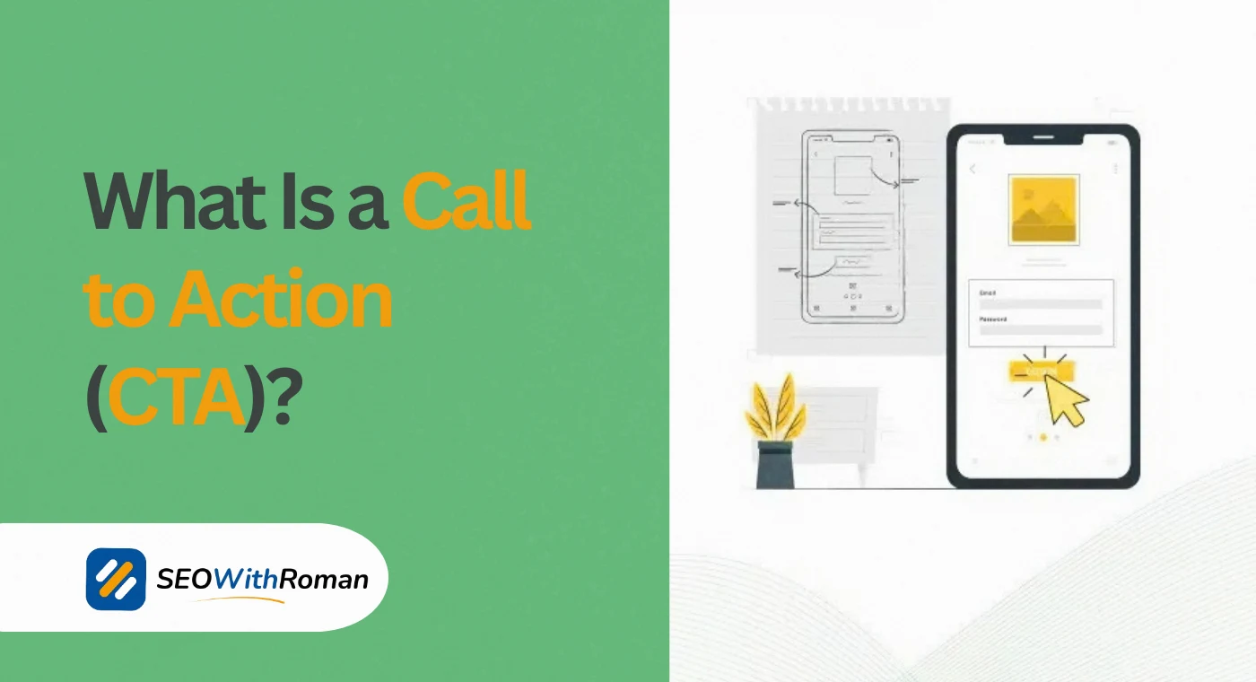
- A call to action is a direct prompt that tells your audience exactly what to do next, and without one, most visitors leave without converting
- CTAs appear everywhere from websites and emails to social media ads and ecommerce product pages
- The best CTAs combine a strong action verb, a clear benefit, and either urgency or emotional appeal
- CTA and CTR are related but different: your CTA is what you write, your CTR measures how many people clicked it
- In ecommerce, CTAs like "Add to Cart" and "Buy Now" directly drive revenue and are among the most tested elements on any product page
1 What Is a Call to Action in Simple Words
A call to action, commonly known as a CTA, is any prompt that tells your audience to take a specific next step.
That is it. No complicated marketing theory required.
When a website button says "Get Started Free," that is a CTA. When an email ends with "Book Your Free Call Today," that is a CTA. When a blog post closes with "Leave a comment below," that is a CTA too.
The term "call to action" literally means what it sounds like. You are calling on your audience to act. The word "action" is doing the heavy lifting. A weak CTA asks. A strong CTA compels.
Here is why this matters more than most business owners realise. Research from Small Biz Genius shows that businesses with clear CTAs on their homepage generate 80% more leads than those without one. That gap exists not because one business has a better product. It exists because one business told visitors what to do next and the other assumed they would figure it out.
People are busy, distracted, and making dozens of micro-decisions per minute when they browse online. A CTA removes that friction. It says: stop thinking, here is your next step, take it now.
Every page on your website that does not have a CTA is leaving money on the table
2 What Does CTA Stand For and Where Did the Term Come From
CTA stands for Call to Action. In marketing, the full phrase and the abbreviation are used interchangeably. You will see both "call to action" and "CTA" used in the same article, the same campaign brief, and the same analytics dashboard.
The concept itself is not new. Direct response advertising in print and radio has used calls to action for over a century. "Call this number now." "Mail in your coupon before Friday." "Visit us before the sale ends." These are all historical CTAs from long before the internet existed.
What changed with digital marketing is measurement. Online, you can now track exactly how many people saw your CTA versus how many clicked it. That ratio is your click-through rate, which brings us to an important distinction most beginners confuse.
What does CTA mean in marketing specifically?
In a marketing context, a CTA is any instruction designed to provoke an immediate response. It moves a potential customer from passive interest to active engagement. Whether the goal is a purchase, a subscription, a download, or a phone call, the CTA is the bridge between interest and action.
What does call to action mean in digital marketing?
In digital marketing, a call to action serves as the conversion mechanism on every campaign, page, and piece of content you produce. Without it, your marketing generates awareness but not results. With a clear CTA aligned to the right stage of the buyer's journey, every piece of content can directly contribute to measurable business outcomes.
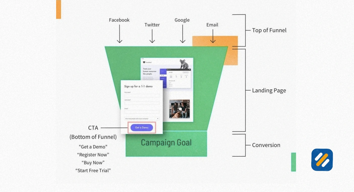
3 CTA vs CTR | Understanding the Difference That Actually Matters
This is one of the most commonly confused pairs of terms in digital marketing. They are related but completely different things.
CTA (Call to Action) is the actual prompt you write or design. It is the button text, the link, the instruction. "Download Your Free Guide" is a CTA. It lives on your page, in your email, or on your ad.
CTR (Click-Through Rate) is the performance metric that measures how effective your CTA is. It is calculated by dividing the number of clicks by the number of impressions, then multiplying by 100 to get a percentage.
If 1,000 people see your email and 50 click the CTA, your CTR is 5%
| Metric | What It Is | What It Measures | Where You Check It |
|---|---|---|---|
| CTA | The actual prompt or button text | Nothing, it is the content itself | Your webpage, email, or ad |
| CTR | Click-through rate, a percentage | How many people clicked vs how many saw it | Google Analytics, GSC, email platform |
| CVR | Conversion rate | How many clickers completed the goal | Google Analytics, CRM |
| Impressions | How many times the CTA was seen | Visibility and reach | Ad platforms, GSC |
Understanding the relationship between CTA and CTR is crucial because your CTA is the lever and CTR is the result. When your CTR is low, the first thing you should review is your CTA language, placement, and design. The number does not lie about whether your prompt is compelling enough.
Average CTR benchmarks vary by industry and channel. For Google search ads, the average CTR is around 3 to 5%. For email marketing, a CTR of 2 to 5% is considered healthy. For website buttons, the benchmark depends on page type and traffic source, but any CTA below 1% CTR warrants an immediate audit.
4 What Is a CTA Marketing Example | Real Brands and What Makes Them Work
The fastest way to understand what a great CTA looks like is to study ones that are already converting at scale. Here are real examples across different industries with a breakdown of exactly why each one works.
| Brand | CTA Text | Type | Why It Works |
|---|---|---|---|
| Spotify | Get 3 Months Free | Subscription | Leads with the offer, not the action. The value is the CTA |
| Dropbox | Get Started for Free | SaaS | "Free" removes the biggest barrier to action at the top of the funnel |
| Netflix | Join Free for a Month | Streaming | Combines belonging ("Join") with zero risk ("Free for a Month") |
| HubSpot | Get HubSpot Free | B2B SaaS | Short, specific, removes friction entirely |
| Dollar Shave Club | Join The Club | Ecommerce subscription | Taps into community and identity, not just transaction |
| Airbnb | Start Earning | Marketplace | Speaks directly to the host's financial motivation |
| Slack | Try for Free | B2B tool | Lowest commitment language possible, highest conversion intent |
| Amazon | Add to Cart | Ecommerce | The universal ecommerce CTA that communicates zero commitment to purchase yet |
The pattern across every high-performing CTA above is the same. They lead with benefit, remove friction, and use the fewest words possible to communicate the next step. Not one of them says "Submit" or "Click Here," which are the two weakest CTA phrases in digital marketing.
5 What Does CTA Mean in Ecommerce | Why It Is the Most Critical Element on Any Product Page
In ecommerce, a call to action is not just a button. It is the single most important conversion element on every product page, category page, and checkout flow on your entire website.
Every ecommerce CTA sits at a critical decision point. The user has evaluated your product, considered the price, and is now deciding whether to continue or leave. Your CTA at that moment either closes the gap or loses the sale.
The most important ecommerce CTAs and what each one signals to the buyer
Add to Cart is the most common ecommerce CTA and the most psychologically clever. It does not ask the buyer to purchase. It asks them to save the product temporarily. This low-commitment language reduces purchase anxiety and increases the probability of checkout completion.
Buy Now skips the cart entirely and takes the user directly to checkout. It works best for impulse purchases, limited-time offers, and single-product purchases where the buyer has already made their decision.
Check Availability works for products with variable stock or custom options. It moves the user forward without triggering price anchoring too early.
Get Yours Before It Sells Out combines urgency with social proof. It works when stock genuinely is limited and the claim is honest.
Start Your Free Trial is the SaaS ecommerce CTA. It removes the payment barrier entirely while still initiating the conversion journey.
The placement of ecommerce CTAs matters as much as the language. Research from the Nielsen Norman Group shows that CTA buttons placed above the fold get significantly more clicks than identical buttons placed below the fold. On mobile, this effect is even more pronounced because users scroll less and decide faster.
6 7 Types of CTAs Every Business Should Know
Not every CTA serves the same purpose. Understanding which type of CTA to use at which stage of the buyer's journey is what separates businesses that convert consistently from those that generate traffic but not revenue.
Type 1: Lead Generation CTAs
These capture contact information, usually an email address, in exchange for something valuable. Examples: "Download the Free Guide," "Get Your Free SEO Audit," "Join 10,000 Subscribers." Used primarily on blog posts, landing pages, and pop-ups.
Type 2: Form Submission CTAs
These complete a contact or enquiry form. Examples: "Send My Request," "Get a Quote," "Book My Free Consultation." The button text on any form is a CTA and it should never say "Submit." Research consistently shows that specific CTA language on form buttons outperforms "Submit" by 30% or more.
Type 3: Product or Service CTAs
These drive direct commercial action. Examples: "Add to Cart," "Buy Now," "Start Your Plan," "Get This Deal." Used on product pages, pricing pages, and promotional banners.
Type 4: Content Discovery CTAs
These encourage deeper engagement with your content. Examples: "Read the Full Guide," "Watch the Tutorial," "See All Case Studies." Used in blog posts, email newsletters, and social media posts to drive page views and reduce bounce rate.
Type 5: Social Sharing CTAs
These extend your reach through your existing audience. Examples: "Share This With Someone Who Needs It," "Tag a Friend Who Does Their Own SEO." Used at the end of blog posts and in social media content.
Type 6: Event and Webinar CTAs
These drive registrations for time-bound opportunities. Examples: "Reserve My Spot," "Register Free," "Claim Your Seat." Urgency and scarcity work especially well here because the event genuinely has a deadline.
Type 7: Retargeting CTAs
These re-engage visitors who did not convert on their first visit. Examples: "Welcome Back, Your Cart Is Waiting," "Pick Up Where You Left Off," "Complete Your Order." Used in retargeting ads and abandoned cart emails.
7 CTA SEO | How Your Call to Action Affects Your Search Rankings
Most SEO guides never discuss CTAs. That is a mistake, because the relationship between your call to action and your SEO performance is real and measurable.
Here is how CTAs directly influence your search engine rankings
Dwell time and bounce rate. When a visitor lands on your page and immediately bounces back to Google, it sends a negative signal about page quality. A well-placed CTA that invites the reader to explore more content, read a related article, or engage with your page reduces bounce rate and increases dwell time. Both of these are user behaviour signals Google uses as indirect ranking factors.
Internal linking through CTAs. Every text-based CTA that links to another page on your website is an internal link. Strategic CTA placement that naturally guides readers to related content builds your internal link structure without requiring any additional SEO work.
Conversion rate and business viability. Google's algorithms increasingly consider whether a website appears to be serving users well. A page that ranks well but converts nobody is a signal that something is wrong with the user experience. Strong CTAs that convert visitors into subscribers, leads, or buyers contribute to the overall trust signals your website sends.
CTA language and featured snippet eligibility. When you answer questions directly in your content (which is what good CTA sections do by explaining what to do next and why), you become eligible for featured snippet positions. Phrases like "what is a call to action" and "how to write a CTA" answered in clear, direct language are exactly the kind of content Google pulls into its answer boxes.
The practical implication is this. Every CTA on SEOWithRoman.com that invites readers to comment, share, or read another article is simultaneously improving your rankings by reducing bounce rate and building internal link authority. CTAs are not just conversion tools. They are an SEO asset hiding in plain sight.
8 How to Write a Call to Action That Actually Gets Clicked | Step by Step
After six years of writing and testing CTAs across B2B, ecommerce, SaaS, and service websites, here is the exact process I follow every time
Step 1: Define the single action you want
Every CTA should drive one specific action. Not two. Not a choice between two options. One clear next step. If your CTA is competing with itself, it will convert at a fraction of its potential.
Step 2: Start with an action verb
Your CTA must open with a verb that creates momentum. Get. Start. Download. Join. Book. Try. Claim. Never open a CTA with a noun or an adjective. "Free Guide Available" is not a CTA. "Download the Free Guide" is.
Step 3: Add the specific benefit
What does the person get by clicking? Be precise. "Get the Guide" is weaker than "Get the Free SEO Checklist." Specificity builds trust and removes the uncertainty that kills clicks.
Step 4: Add urgency or scarcity where it is genuine
"Book a Free Consultation" converts. "Book Your Free Consultation | Only 3 Spots Left This Month" converts better, but only if the scarcity is real. False urgency destroys trust the moment a visitor realises the scarcity was manufactured.
Step 5: Test your CTA language regularly
No CTA is permanent. The best performing button text on your website today may underperform in six months as your audience changes or your traffic source shifts. Run A/B tests on CTA language, colour, size, and placement at least once per quarter on your highest-traffic pages.
Step 6: Match your CTA to the buyer's stage
A visitor reading a beginner SEO guide is not ready to "Hire Me Now." They are ready to "Download the Free SEO Checklist" or "Read the Next Guide." Match your CTA to where the reader is in their journey, not where you want them to be.
9 CTA Best Practices | What the Data Actually Shows
| Best Practice | What Research Shows | Practical Application |
|---|---|---|
| Use first-person language | "Start My Free Trial" outperforms "Start Your Free Trial" by up to 90% (Unbounce) | Rewrite button text in the reader's voice, not yours |
| Contrasting button colour | Buttons that contrast with the page background increase CTR by 21% (HubSpot) | Never use the same colour for your CTA button as your main brand colour |
| Button size on mobile | CTAs need a minimum tap target of 44x44 pixels on mobile (Apple HIG) | Test every CTA on mobile before publishing |
| Above the fold placement | CTAs placed above the fold get 73% of all CTA clicks on average pages | Always include at least one CTA before the first scroll on any landing page |
| Urgency language | Adding urgency to CTAs increases conversions by 332% in email (Campaign Monitor) | Use urgency only when it is genuine or you erode trust permanently |
| Number of CTAs per page | Pages with one primary CTA convert 371% better than pages with multiple competing CTAs (WordStream) | One primary CTA per page, secondary CTAs for content discovery only |
| Personalised CTAs | Personalised CTAs convert 202% better than generic ones (HubSpot) | Use dynamic CTAs based on traffic source, returning visitor status, or location |
10 3 Expert Tips to Write CTAs That Outperform Your Competitors
Tip 1: Never use "Submit" as your button text.
"Submit" is the single worst word in CTA history. It tells the user what they are giving up (their information) rather than what they are getting. Replace every "Submit" button on your website with specific benefit language right now. "Get My Free Quote," "Send My Request," or "Start My Consultation" all outperform "Submit" without exception.
Tip 2: Test your CTA on someone who has never seen your website.
Show your page to someone unfamiliar with your business and ask them one question: "What would you click first on this page and why?" If they cannot answer within five seconds or they point to the wrong element, your CTA is not prominent enough. Real users do not read pages. They scan them. Your CTA needs to win that scan.
Tip 3: Match your CTA to the emotional state of your reader at that exact moment.
A reader who just finished a section on why their website is getting no traffic is experiencing frustration. A CTA that says "Fix Your SEO Today" meets them exactly where they are emotionally. A CTA that says "Learn More About Our Services" misses the moment entirely. Study what emotion your content creates and write a CTA that resolves it.
11 Conclusion
A call to action is not just a button on a webpage. It is the moment where your marketing either converts or collapses. Every page, every email, every social post, and every ad you create needs one clear, specific, benefit-driven CTA that tells your audience exactly what to do next and why they should do it right now.
The businesses winning online in 2026 are not the ones with the biggest budgets or the most content. They are the ones whose CTAs are clear enough to convert curious visitors into committed customers, one click at a time.
Start by auditing every page on your website today. Ask yourself: does this page have a clear CTA? Does the language lead with benefit? Is it placed where the eye naturally goes? Fix the ones that fail those three questions and your conversions will improve before you change a single other thing.
Have a question about writing CTAs for your specific business or industry? Leave a comment below and I will help you write one that works.
Join 1,000+ business owners and bloggers who get one actionable SEO tip every week — straight to their inbox. Free forever.
Get Free Weekly Tips →